Clearly, the COVID-19 pandemic has caused us nothing but fear and anxiety as the number of people getting sick exceeds the maximum limit of patients the hospital or facility can take care of. That’s why social distancing is strictly imposed in order to prevent the spread of coronavirus in communities.
Social distancing means staying six feet away from other people to lessen the chance of transmitting the virus (in case you are an asymptomatic carrier). This prohibits people from attending crowded gatherings such as concerts, cruises, festivals, and sports events.
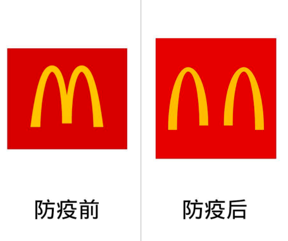
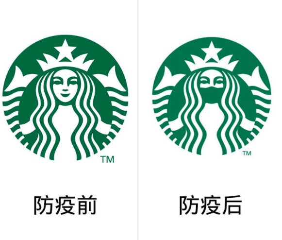
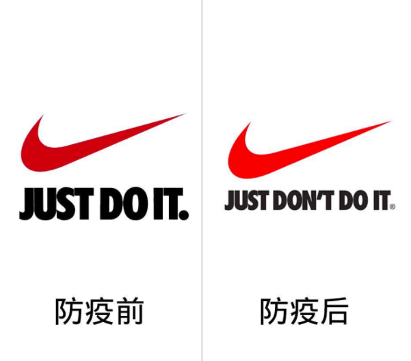
With a lot of people (from across the world) joining the campaign about the importance of social distancing, Slovenia-based graphic designer Jure Tovrljan showed his support by redesigning the brand logos of famous companies.
Originally posted on Tovrljan’s Behance page, the logos (which he named “coronavirus logos”) have already gained more than 87,000 views and 1,500 likes, as of this writing. Meanwhile, Facebook page Asians Never Die reshared a series of side-by-side photos, showing the original logos and Tovrljan’s versions.
No one ain’t lovin’ the outbreak, not even Mcdonalds
A cup of coffee can keep you warm but a mask can keep you safe
Since the Tokyo Olympics is officially postponed, its re-designed logo now says: “practice safety distance!”
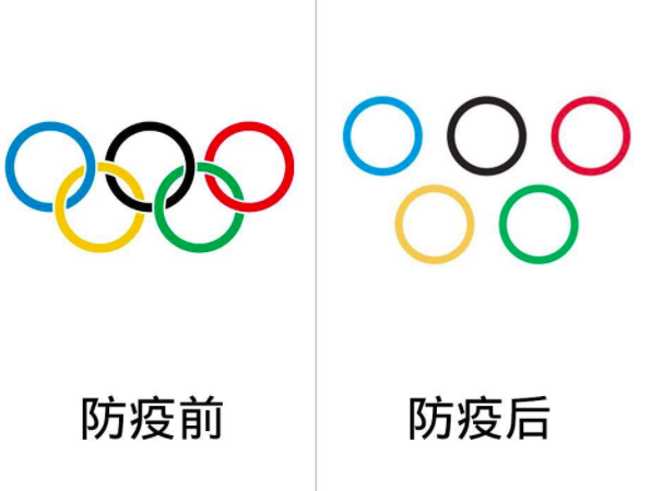
These overlapping red and yellow circles need to be separated (for now) to maintain social distancing

“Locked in” and “Just don’t do it” means PLEASE. STAY. HOME.

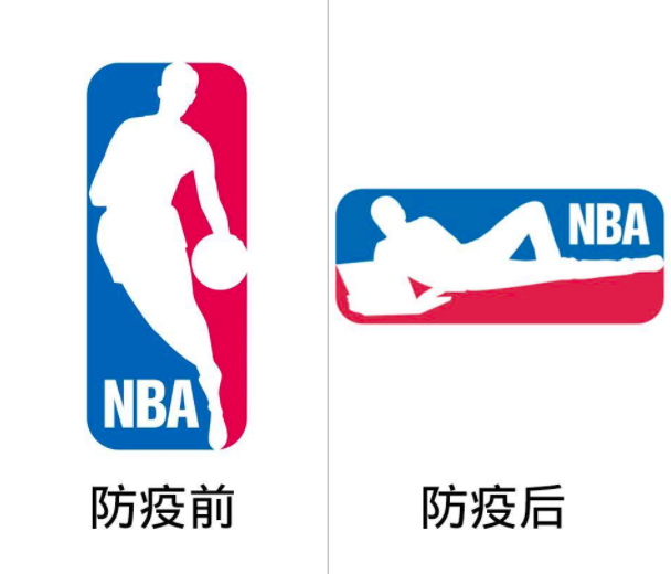
Even the NBA needs to work from home
It looks like 2020 isn’t our year

Sadly, this one needs a new name

May these brand logos remind you why we need to stay home and practice social distancing!
/TV
POP! Stories we think you might also like:
These redesigned bank logos will make you see how underappreciated artists are today
Man, who was once homeless, assembles hand washing stations for the unsheltered
This family recreates Disney’s Splash Mountain ride while in quarantine
Paulo Coelho offers free e-books for fans to read while in self-quarantine

