Before Facebook started to monopolize the digital space, our titos (uncles) and titas (aunts) would usually spend most of their free time on Friendster. It was rather a “wholesome” social networking site where people—instead of clicking the like or heart button—exchanged lengthy and sometimes glitterfied testis (testimonials) with their ka-Friendster. (Sorry if this sounds very ancient to you, TikTok kids.)
But due to a number of factors, Friendster eventually met its demise in 2015—after 13 years of serving as the world’s leading social network. Now that our newsfeeds are often plagued by news and trolls, don’t you ever wonder about how Friendster would have looked like if it were still around in 2020?
A local designer may have an answer for that.
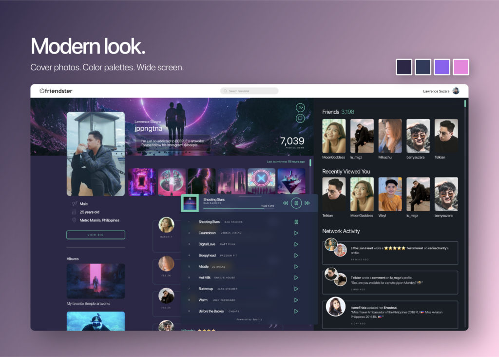
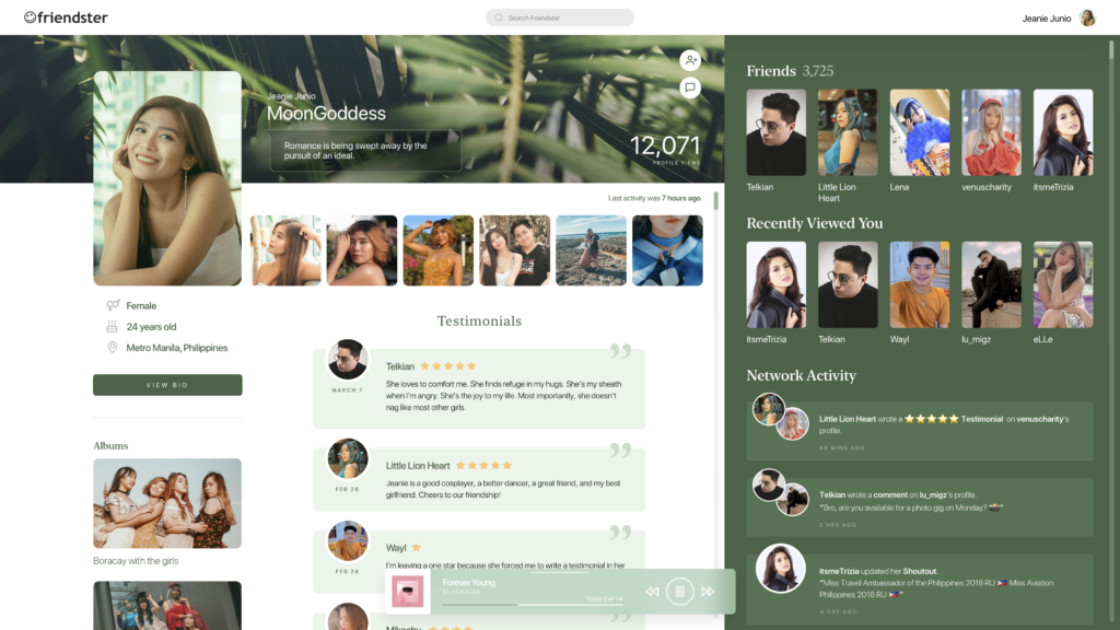
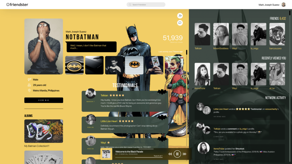
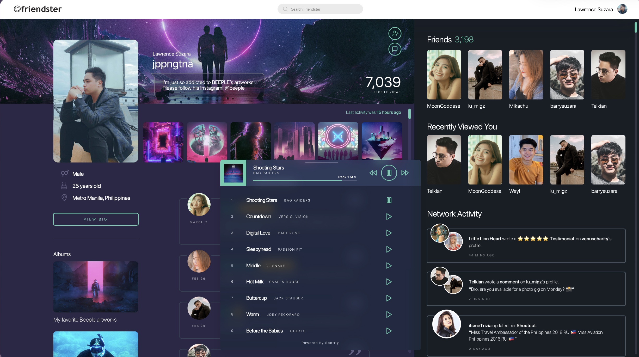
Lawrence Suzara, a senior multimedia designer for an international company, reimagined the “grandfather of social networking sites” in these modern layouts.


Although Suzara’s version is very 2020, he still retained the same features (including custom themes, testimonial page, and music players) that made Friendster fun and promising back then.
Speaking to POP!, Suzara said: “During this quarantine, I got to spend more time on Facebook. I realized that though the UI design is clean, it gets boring quickly (and sometimes the platform is too toxic). So I remembered the days when I was still using Friendster where I can express my personality through my profile page.
Also, there wasn’t a news feed where people can share toxicity via open discussion. In Friendster, you just share your personal thoughts with your friends. So yeah, I missed all of those and thought, what would Friendster look like if it was still a thing today?” he explained.
Of course, online users who came across his post couldn’t help but suddenly feel nostalgic about it. If you were to ask me, I’d customize my mouse cursor in a heartbeat (if only that was possible now).
_____
Read more from InqPOP!:
This company sells a variety of corsets for men who want to achieve an ‘hourglass figure‘


