When the new trailer of Steven Spielberg’s adaptation of the sci-fi novel Ready Player One by American author Ernest Cline was recently released, it received very good reviews from fans. The trailer contained several pop-culture references and gave a glimpse of the digital world that made every fan excited for it.
From director Steven Spielberg comes #ReadyPlayerOne – in theaters March 30. Watch the new trailer! pic.twitter.com/BHJ9kN8GTB
— Ready Player One (@readyplayerone) December 10, 2017
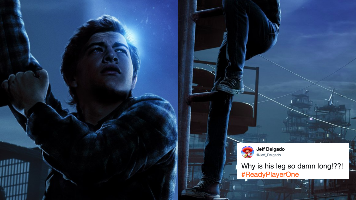
But despite its very appealing trailer, the new poster is a different story altogether. People were quick to notice a minor detail that made it look rather off. The lead actor, Tye Sheridan, is climbing up a ladder but his right leg looked extremely long.
A better reality awaits. Tune in tomorrow at 9:45a PT for a special live stream event with @erniecline. #ReadyPlayerOne pic.twitter.com/X7M4IahKAC
— Ready Player One (@readyplayerone) December 9, 2017
His right leg looked longer than his other leg up the ladder. The “mistake” is very noticeable that people are not letting it slide. Some were quick to point it out and wondered how they allowed it to be released.
Why is his leg so damn long!??! #ReadyPlayerOne pic.twitter.com/vA0EZH39fa
— Jeff Delgado (@Jeff_Delgado) December 9, 2017
https://twitter.com/asher_nieman/status/939624587762982912
Others poked fun of Sheridan’s appendage and came up with their funniest memes.
“I wish I was taller!”
*POOF!*
“Oops. Is just one leg ok?” #ReadyPlayerOne pic.twitter.com/lopVYW9mEN
— Butch Hartman (@realhartman) December 9, 2017
https://twitter.com/guscraw/status/939637729016582145
Ready Player One pinta que te cagas . Grande, Spielberg. pic.twitter.com/eFLtJeWZxI
— Pablo González (@Caith_Sith) December 10, 2017
— Dennis 🌿 (@BDaDennis) December 10, 2017
Awesome new Ready Player One poster pic.twitter.com/DmQdwPnCfG
— Axur (@AxurEneas) December 9, 2017
The artist behind the READY PLAYER ONE poster finds all your long leg jokes very offensive. pic.twitter.com/IoCimnVrsb
— Edwin Davies (@EdwinJDavies) December 9, 2017
People have complained about that Ready Player One poster but it can be easily fixed with an inspirational tagline pic.twitter.com/CmJJnVrcaC
— pixelatedboat aka “mr tweets” (@pixelatedboat) December 10, 2017
While some people decided to “fix” the poster themselves in the wittiest way possible.
https://twitter.com/DarkPlatinumFR/status/939917482655141888
improved #ReadyPlayerOne poster pic.twitter.com/tmFxZXBVZR
— Maximilian Henning (@zarasophos) December 10, 2017
https://twitter.com/SoylentsGreen/status/939657044382175232
Fixed it! You're welcome SPIELBERG! #ReadyPlayerOne pic.twitter.com/BKGfpYSwdy
— Jeff Delgado (@Jeff_Delgado) December 9, 2017
fixed it pic.twitter.com/x64IayJDaw
— Rev. Ethan Waterman (@WatermanATX) December 10, 2017
Twitter user @CDisillusion, however, came up with a thread that proves how Sheridan’s leg in the poster is in fact, “proportionally correct.”
The leg in the Ready Player One poster is proportionally correct. THREAD!
— Captain Disillusion (@CDisillusion) December 10, 2017
First, let's look at body proportions. Many resources on drawing will tell you that the average human crotch occurs at the half-way point along the length of the body. Here's an illustration from 'Drawing the Head and Figure' by Jack Hamm. pic.twitter.com/bKkYGIpMDC
— Captain Disillusion (@CDisillusion) December 10, 2017
Easy to see in a straight-on view, but how do we check in perspective? Let's simplify things by putting the body in a bounding box. pic.twitter.com/5pfdvmBPO4
— Captain Disillusion (@CDisillusion) December 10, 2017
If we connect opposite corners of the box with straight lines, they will cross at the center, a.k.a. the crotch. pic.twitter.com/A9Ot2VExSP
— Captain Disillusion (@CDisillusion) December 10, 2017
How's about we now connect the opposite corners with straight lines like we did before? Let's! pic.twitter.com/O38dUs3LLt
— Captain Disillusion (@CDisillusion) December 10, 2017
Well, what do you know? The half-way point, as dictated by the rules of perspective, lands squarely on his crotch! The part of the body below the crotch, a.k.a. the leg, appears to take the amount of space in the bounding box it's typically supposed to. pic.twitter.com/zNooHFgEXD
— Captain Disillusion (@CDisillusion) December 10, 2017
He added that it all boils down to this: In art, when something is technically correct, but still looks aesthetically “off”, the artist should probably go with what feels aesthetically better, rules be damned.
But then again, artists can just do whatever they feel like because, well, they’re artists.

/RNA


