In the graphic design’s world, font choice is everything. It doesn’t just accentuate the overall design of content, but it also affects the impact of the message.
And speaking of which, Netflix UK’s newest content had its viewers shookt.
In a recent post by DesignTAXI, Netflix UK added 2012 Hong Kong rom-com film, Love in the Buff to its lineup. To cater the English-speaking audience, they came up with their own film poster fronted by a really interesting choice of typography.
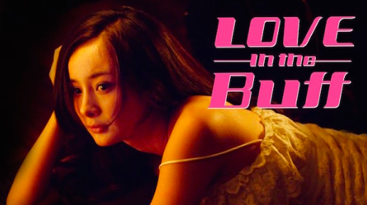
The thumbnail graphic, along with the font that appears to read “Love in the Butt,” caused a long-ass discussion on one of Reddit’s sub communities: R/CrappyDesigns.
Reddit user, u/whalecat_of_the_sea, captioned the post, “Browsing Netflix’s recently added section and came across this awful font choice for the word ‘Buff.'”
Browsing Netflix’s recently added section and came across this awful font choice for the word ‘Buff’ byu/whalecat_of_the_sea inCrappyDesign
The hilarious typeface and photo pairing had netizens wondering, “is it crappy design or genius design?”
Comment byu/whalecat_of_the_sea from discussion
inCrappyDesign
Comment byu/whalecat_of_the_sea from discussion
inCrappyDesign
Redditor u/ScientistRickSanchez, believed that the designers behind the poster knew exactly what they were doing.
Comment byu/whalecat_of_the_sea from discussion
inCrappyDesign
And the design continued to inspire even funnier responses… that were rather asstounding.
Comment byu/whalecat_of_the_sea from discussion
inCrappyDesign
Comment byu/whalecat_of_the_sea from discussion
inCrappyDesign
Comment byu/whalecat_of_the_sea from discussion
inCrappyDesign
Of course, these funny comebacks didn’t help the film boosts its score on movie database website, IMDB.
But just like the Nike’s controversial ad, Netflix UK surely succeeded in grabbing its viewers’ attention.
—
Read more from InqPOP!:
‘The Haunting of Hill House’ launches on Netflix on Oct 12
Steven Spielbergs Schindlers List is returning to theaters for its 25th anniversary