The official logo of the 30th Southeast Asian Games became a hot topic last year as the lack of creativity in the design drew flak from people online. Alan Peter Cayetano, Department of Foreign Affairs secretary and chairman of the 2019 Southeast Asian Games Organizing Committee, said that the 11 circles in the logo represents the “11 countries bound together in the shape of the Philippines to symbolize that wherever and whenever the games are played we are one and we win as one.” But let’s be honest, it looks like a kid scattered some rubber bands and the designer caught on and said: “Ay, ‘yan, pwede na ‘yan!”
https://www.facebook.com/MalacanangEvents/posts/256051701700319
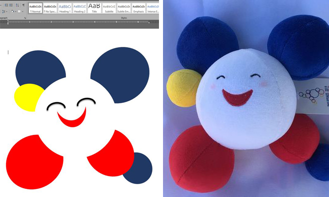
Despite the outpour of negative comments online and better alternatives from other designers, the logo still pushed through and Cayetano was confident that people would see the purpose of the campaign after it is launched. Recently, the design of the official 2019 SEA Games mascot, Pami, was introduced to the public and people couldn’t help but call out and ridicule the equally effortless mascot design.
⚛ #SEAGames2019 | Let's start to know more about #SEAGames2019?
🔸 Meet "PAMI" – "Pami" is the official mascot of the 2019 SEA Games. "Pami," short for the Filipino word "pamilya,"or "family" is a smiling sponge ball-type figure. pic.twitter.com/9jvAJjWgJZ— SEA Sports News (@sea_sports_news) January 8, 2019
Bat mas maganda pa yung 2005 sa 2019??! Anyare? 🤦🏻♂️🙅🏻♂️ #SEAGames2019 @psc_gov pic.twitter.com/gwd2hW82No
— Volleytrails🏐 (@TwoCityTrails) January 8, 2019
Anong klaseng logo naman po yan!? Eh parang naglaro lang kayo ng "small circle small circle big circle" eh #SEAGames2019 pic.twitter.com/fjmSydBzCa
— PostProdPeopleOfMNL (@PostProdPipsMNL) January 10, 2019
Y'all can spend so much of our tax money for #SEAGames2019 but can't even spend a dime to hire decent graphic designers and conceptors for the logo design and mascot. What the hell is this ishhh!!? We've seen better artwork from a kindergarten student! https://t.co/fbRyi6Vr9E
— Dax Luy (@nervdax) January 9, 2019
https://twitter.com/earlgermina/status/1083198885051289608?s=21
Many were disappointed about the official mascot and netizens cited lacking in effort and creativity in the design. People are calling out the “lame design” and subpar quality of the mascot.
We're sorry to the SEA community for a lame design. For sure madaling masira yung stuff toy na yan, gagawin sa divisoria. #SEAGames2019 https://t.co/EG2ZKrGwEH
— alexxisss (@axxaxxpxx) January 9, 2019
https://twitter.com/jermracela/status/1083264099952267264
It also looks like a work of a student who had to come up with something he/she can submit on the day of the deadline. Every student probably had their own “mema” moments, but the good thing is that it’s just for school and not for international representation like this. MS Word was probably put into use for this national project and it shows.
They probably pitched it using MS Word, huh? pic.twitter.com/ocfixnDD26
— J (@ceeejong) January 9, 2019
Ganito sya kadali gawin. MS WORD. LORDT. https://t.co/1RRrHLylCa
— E (@MadamHiddles) January 10, 2019
https://twitter.com/wANTONnoodls/status/1031835864362442752
People are saying that the design of the logo and the mascot were a waste of taxpayers’ money. The government could do better than settle for mediocrity and not hire competent designers to come up with something that would truly represent our country.
I could dismiss this as a petty issue if you did not pay AT ALL for the design of this mascot + the official logo, @alanpcayetano. Please say these were all free and not a big waste of taxpayers’ money and you’re not a bad steward of the resources entrusted to you. #SEAGames2019 https://t.co/sApzqUz7ZC
— ohanna (@AnnaGreenGable) January 10, 2019
Some say there’s probably a reason why it was made out of circles and reimagined what it truly represents.
Alam niyo ba kung bakit puro bilog? Kasi binibilog lang ang mga ulo natin ng gobyerno na ito. 🤭#SEAGames2019 pic.twitter.com/ccbHh9Jclx
— Vince 🥀 (@vcsporrazzo) January 10, 2019
https://twitter.com/jaikodr/status/1082944728419557376?s=21
Others played around the name “Pami” and came up with more appropriate meanings of it.
Pami as in pami-diocre nang pa-mediocre ang #SEAGames2019 creative content. https://t.co/lP68b1U8zR
— Ralph (@heyralphhey) January 9, 2019
https://twitter.com/shairaptrc/status/1082991454816010240?s=21
Some even think that the name “Pami” might be from Janina San Miguel’s iconic Bb Pilipinas answer. Can’t believe this design came from one of the *tough* ten though.
https://twitter.com/jhuncarlll/status/1082958672379011072?s=21
my pamily is the most important persons in my life #SEAGames2019 https://t.co/MMu6ev53bV
— aljay (@notaljaylan) January 9, 2019
People also shared how the construction of sports complex in Clark, Pampanga displaces Aeta families who won’t be able to smile like Pami.
#SEAGames2019 | Let's start to know more about #SEAGames2019?
🔸Dahil sa ipinapatayong Clark New City na pagdarausan ng SEA games ay LIBU-LIBONG PAMILYANG AETA ang mawawalan ng tirahan at mahigit 20,000 ang hindi na makakangiti dulot ng pagpapalayas sa kanilang lupang ninuno. https://t.co/fSsukzIPEW
— mayka 🍉 (@maykamaykaba) January 9, 2019
That Sea Games logo though is not the only thing cringe worthy. The sports complex being constructed in Clark meant massive displacement for our Aeta brothers and sisters, again. pic.twitter.com/0xBtWibjT5
— Hustles for Christ (@mikonsepto) August 24, 2018
'Yang ngiting iyan ay ninakaw sa libo-libong pamilyang katutubo na mapapalayas sa kanilang ninunong lupa, 'yung mga pamilyang sa mahabang panahon ay nanahan sa mga lupaing katitirikan ng kalabisan ng palarong kapitalista. #SEAGames2019 https://t.co/opAgHPglFd
— anima crispy (@daybergent) January 9, 2019
If the goal was to create a logo that would be “remembered in time and those which a grade 4 or grade 5 student could draw,” then, damn, they succeeded. Owmaygahd, my PAMIlee!


