virIDescent: Reducing Carbon Footprint through Interior Design
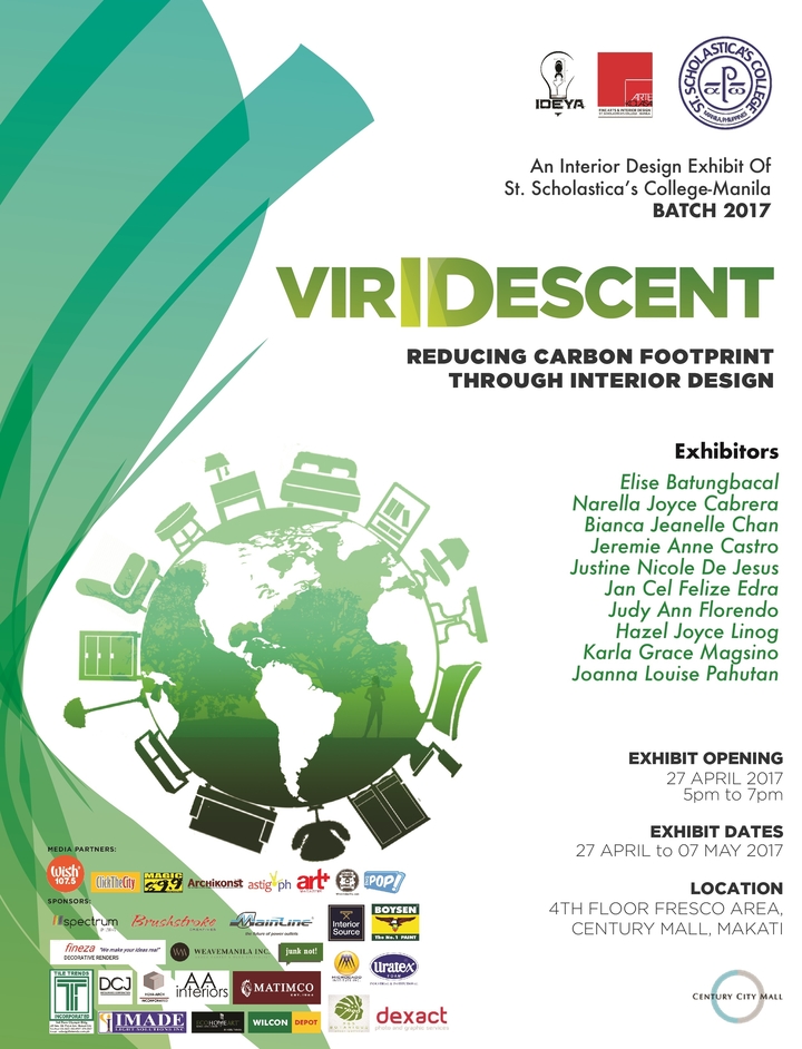
The Senior Interior Design students of St. Scholastica’s College-Manila will be holding its 18th Interior Design Graduation exhibit entitled “Viridescent: Reducing Carbon Footprint through Interior Design” at Century City Mall, Makati from April 27-May 7, 2017. This exhibit consists of eleven (10) booths that have diverse existing projects.
Viridescent is an adjective word meaning green or becoming green.
A carbon footprint is the negative impact of people in the environment through the everyday activities and behavior. Buildings account for high percentage of carbon dioxide emissions. A building’s carbon footprint is the amount of Carbon dioxide it produces during its operations and activities.
Everyone has heard of the environmental challenges locally and globally. This might seem impossible to solve but every little step to mitigation can make a difference. Every profession has something to contribute for the good of the environment. It is a great place to start with the work field that we are about to take. As aspiring Interior Designers, designing a built environment while reducing carbon footprint have cost benefits and revenue opportunities especially because each booth works on a commercial type of Interiors like hotels, schools, offices, aviation, hospital, child care facility, and restaurants.
10 student will showcase 10 commercial spaces:
- Hotel Suite
Designer: Elise Batungbacal
Rationale:
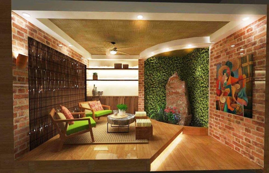
This lounge area is located at The Plaza Hotel Balanga. The design incorporates a Modern Filipino Contemporary interior that showcases some indigenous materials found in the Philippines. The design also focuses on regenerating the space in making a sustainable green environment through an eco-initiative approach with the use of natural resources that are efficient; and resources that will not compromise the health of the environment and/or the health of the occupancy. An indoor pocket garden was integrated in the interior to balance the humidity inside the area and also a water feature That adds up to the relaxing nature ambiance.
- Creatives’ Office
Designer: Narella Joyce Cabrera
Rationale:
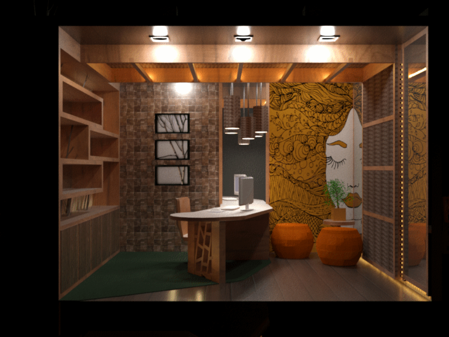
The space is a creatives office which is designed in such a way that it sparks creativity in the occupant’s mind but doesn’t make use of too much elements that it disrupts them in creating a coherent work.
The design of this office intends to help the environment by lessening the carbon foot print it produces in it’s designing and construction. This is done by using locally available and abundant resources such as coconut tree related materials like it’s lumber, shell, and leaf which can be found easily in the Philippines. Reduction of energy consumption is also considered in the designing thus the use of LED lighting for lesser wattage usage. Lastly, air pollution is minimized in the space with the use of coconut shell activated charcoal that is hidden withing the design, this certain material can filter harmful VOC’s, Formaldehyde, and other airborne ozones in the air which can be harmful to the health of the user. Overall design promotes the usage of a locally and readily available materials that are sustainable as means in designing.
- Child Care Facility
Designer: Bianca Jeanelle Chan
Rationale:
Two words can represent Tropical themed interiors. Pause represents the neutral colors while play represents the vibrancy of colors present in this theme.
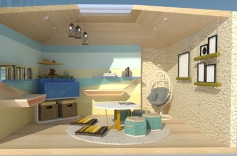
SOS Children’s Village Manila is a loving home for orphaned, neglected and abandoned children. This activity area is located in the family house which is occupied by approximately ten children, a foster mother and an auntie. The ages of the children range from three years old to eighteen. This room conveys the effects of climate change in Interior Design mainly on heat build-up because of the skylight and the ventilation. Since this is a child care facility relying on international funds and dole outs, the goal is to lower its energy expenditure without compromising comfort.
Nature elements were used such as seascape, sunset, and water feature because of its familiarity for the children. In this area, kids can play and have tutorials and teenagers can study at the same time. An Aquaponics system was used through an aquarium setup. Aquaponics is a combination of aquaculture and hydroponics, a soil less farming. Water in motion such as waterfalls has positive psychological effects on children. As a foster mother, handling ten children with different backgrounds is challenging. A water feature can calm the playful spirit instilled in kids. A hanging chair is placed in a corner so the SOS mother can still relax and monitor the children. Stools have extra storage under the cushion and it also has a fabric handle for easy handling.
- Conference Room
Designer: Jeremie Anne Castro
Rationale:
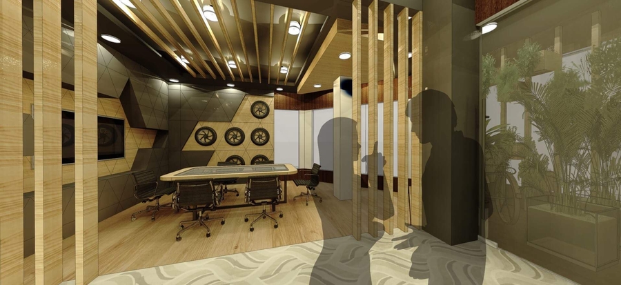
A series of triangular pattern which gives indication of hierarchy, Triangular Pattern is applied in the design to form a unique decoration of the furniture and ceiling, it also gives compliment to the top position and owner of the Ropali Building like the shape of the triangle having the top point of three connected dots.
The Beauty and the versatility of the wood veneers are used in the wall finishes to show the availability of common solid woods and exotics is decreasing yet the demand remains high for consumers who love the look and feel of natural wood products. Veneer is more ecologically friendly alternative to solid hardwoods. The use of banana bark is also applied to the design in the wall finishes to show the process of converting waste materials into new products and giving people a good solution for waste reduction. Laminated wood planks is also used for the flooring it has a unique multi layer anti-bacterial mechanism and mildew for a long time widely with high efficiency and safety that could also last for more than 15 years lifespan it is also Fade and moisture resistant from eurotex.
- Bar
Designer: Justine Nicole De Jesus
Rationale:
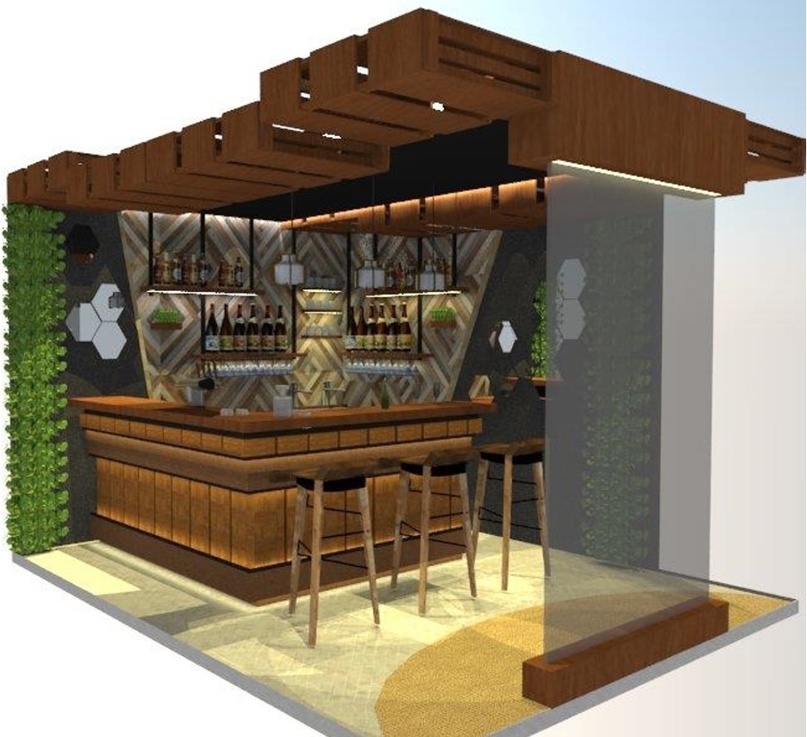
The materials used in the exhibit booth are organic, indigenous and recycled materials. Wood crates are made from big pieces of wood scraps in constructions and some it has been used a container of delicate furniture and some other stuff, same with the wood that are used for the shelving and counter. Fineza finish wall is known for its use of organic ingredients in making the cement or the faux. Water is known to make a space cooler and relaxing, so putting up a waterfall will help the circulation of the air be cooler and will help the ambiance be more relaxing because of its sounds. And the number one design in making a place eco-friendly is the use or play of plants, Boston fern is one of the most air purifying plants that are suitable for indoors.
- Massage/Treatment Room
Designer: Jan Cel Edra
Rationale:
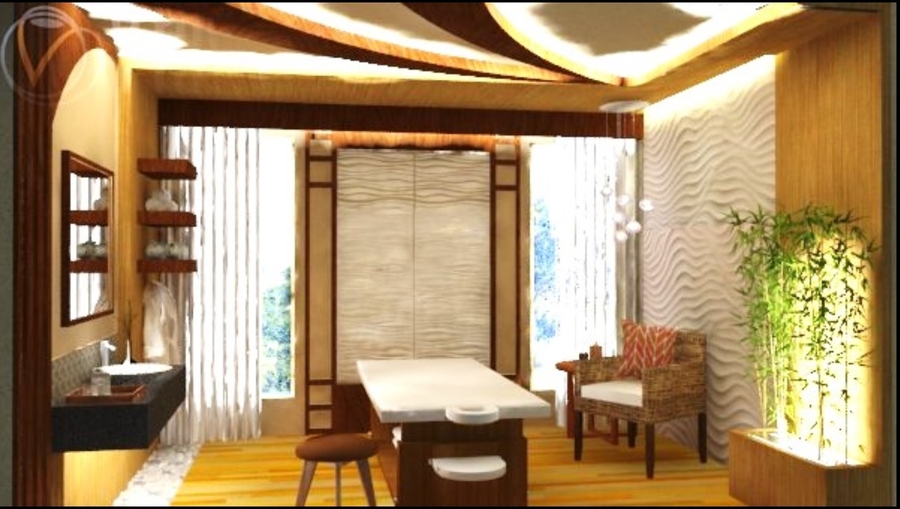
This is a spa located at a hotel in the province of Batangas. An Asian-contemporary theme was chosen as the client wanted Asian features incorporated to his modern contemporary hotel. To achieve a full relaxing ambiance, the place should reflect on what it has to offer in a calm environment. Asian designs and themes are mainly inspired by the elements colors of nature. These are earth colors that bring a calming setting that offers a casual and laid-back atmosphere. The design is unified through the application of waves which reflects water and air. Organic textures showcase relaxing ambiance which summons an atmosphere of peacefulness and tranquility.
One aspect of Asian design that is the appeal to the ecoconscious proprietors out there. The furnishings and accessories chosen are organic and local products to reduce carbon footprints. The addition of plants and greeneries would get that nature’s ambiance to meet the ideal look of bringing the outdoor indoor and would help improve circulation of air. There is more to just recycling materials to have a green design. Bamboo is considered the best example of sustainability aside from the fact that it grows quickly and doesn’t require a lot of maintenance, it is very durable, it caters to many applications but in this design, it is decided to feature it as flooring. The use of low VOC paint lessens the dispersal of harmful substances into the atmosphere. Moreover, the use of energy efficient lighting lessens wastage of electricity consumption. Now that many great visionaries had produced a lot of innovative products such as tiles made from volcanic ashes and has the ability to control humidity, reduce odor and adsorb harmful substances. This kind of product was applied at the center wall as a focal point.
- Dean’s Office
Designer: Judy Ann Florendo
Rationale:
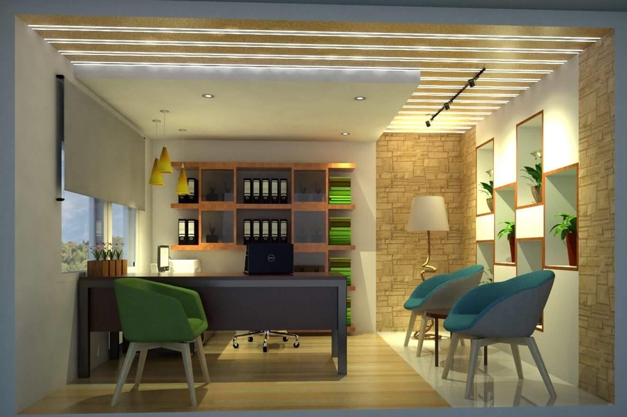
A dean is the person with significant authority over a specific academic unit, or over a specific area of concern, or both. The user of this room is a male with an age range of 30-40 years old and he is the Dean of the Office of Student Affairs. Balance and Focus are the two words that will help to represent the theme or the design of the room.
Balance will stand for the indoor plants and stone bricks that will be seen at the right wall and some parts of the back wall, the indoor plants will help to reduced carbon dioxide levels of the room, increasing the humidity, reducing the levels of certain pollutants such as benzene and nitrogen dioxide, reducing airborne dust levels, and keeping the air temperatures down while the stone brick wall finish will help the room to be capable enough to resist fire, wind, water as well as various insects including termites. Focus will stand for the division of the design that will be seen in the room,there are two spots that shown in this room. From the line of drop ceiling to wall and wood flooring it will shows the working spot of the Dean, and in the remaining part are the spot for his visitors that has coffee table and accent chairs and in addition to that the materials that are used in the furniture are wood and banig finish at the coffee table.
- Aviation Authority Main Building Lobby
Designer: Hazel Joyce Linog
Rationale:
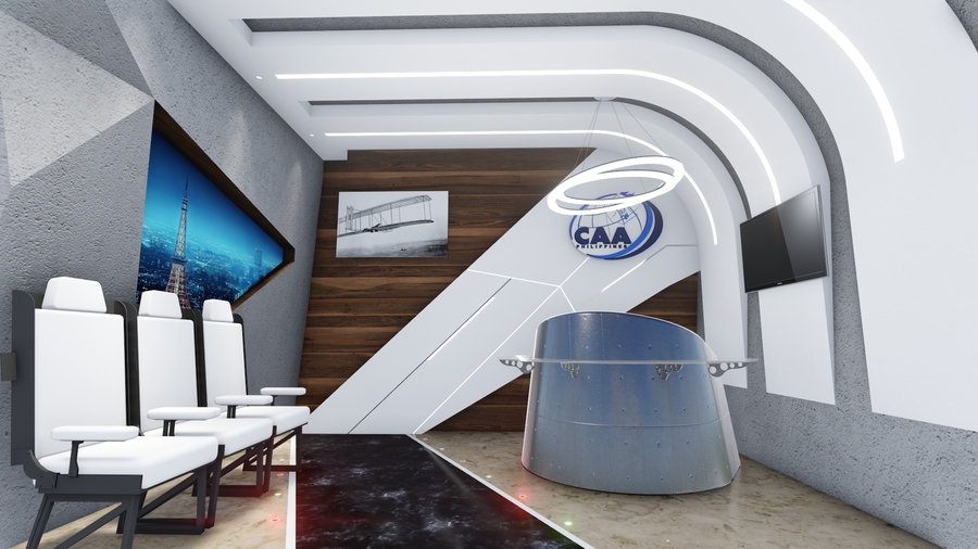
Her sub goal was to project the environment where an airplane moves and to highlight some of its parts, which are related to aviation, like its: a) runway seen through the black marble flooring, b) wing seen through the white part in the middle wall including its details shown through the incised parts with some having LED strip lights on it for emphasis, c) aircraft engine seen through the reception desk which even has ribbets, and d) usual economy class seat, concerned with the term civil or for ordinary people in civil aviation, which was refurbished and reupholstered.
She also incorporated the pendant light inspired with the orbit, the movement of the planets to the sun or an airplane waiting for its turn to land when they are having aircraft traffic or congestions on the ground, and the curved element or shape of the extended ceiling to wall design to portray the belief that the world has no end as it is spherical.
As the designer gives importance to the environment, our nature, without compromising the establishment’s functionality, modernity, aesthetics and employees’ health and comfortability, these are the main factors which made her design an environmentally responsible one:
1) Used light colors – for illumination of lights to the walls which spreads throughout the room easier and faster since light colors does not absorb too much of the wavelength but rather makes the illumination bounce 2) Used LED lights – Less energy consumption 3) Retained the existing flooring – “Making use of what we already have” ; Less energy produced for reconstruction 4) Used reclaimed wood – “Making use of what we already have” ; Avoid cutting virgin trees ; Make use of scrap woods, and 5) Used surplus plane seats for less production of new seats.
Furthermore, as the establishment was designed by the year 2000 National Artist Architect Leandro V. Locsin, a key feature of his notable works such of Cultural Center of the Philippines (CCP) is seen through the faux concrete material used for the western and eastern wall even through the curvature of the ceiling and eastern wall.
The designer changed the conventional shape of an airplane window to make it more interesting and even put uneven depths on wall just like of a mountain seen during the flight. The first ever airplane invented by the Wright Brothers is also displayed and the television will play videos, and flash pictures and facts about aviation and CAAP.
- School’s Reception Area
Designer: Karla Grace Magsino
Rationale:
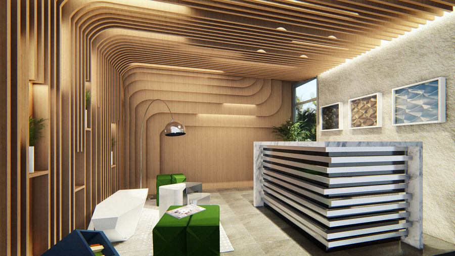
This reception area for a maritime faculty office attempts to extract the essence of place and respond to the context in which it sits. Situated in Alabang, Muntinlupa and with views of Laguna Lake, the visual composition of this area combines the timelessness, simplicity and indurating trellis that mimic the sea waves. The design intends to instill the presence of what the institution has to offer onto its visitors – Maritime College.
The section is intended to create a welcoming reception area in the faculty office in order to encourage students to have carefree interaction with their professors. The modern concept is more of a student-centered design that also shows the school’s academic profile and would bring an outstanding reputation to their campus.
The construction of cutting edge campus would also focus on low energy use and positive environmental impact to provide habitable spaces. High performance glazed windows would help in blocking out heat that will result in a cooler atmosphere within the area, thus, lessening energy consumption and making it cost efficient. Moreover, natural lighting increases the occupant’s productivity and comfort as well as enhances their mental and visual stimulation. The backdrop of the reception is covered with a wallpaper made of agricultural waste like pineapple and banana fiber which is environmental friendly and also visually appealing.
Students and teachers spend most of their time staying indoors, however the exposure to pollution may still occur due to wrong selection of building materials, furnishings and poor air ventilation designs that may lead to respiratory health risks. High quality standard furniture, finishes that has low counts of volatile organic compounds (VOC), thermal comfort, lighting and improved indoor air quality is the formula to establish healthy rooms.
- Student Lounge
Designer: Joanna Louise Pahutan
Rationale:
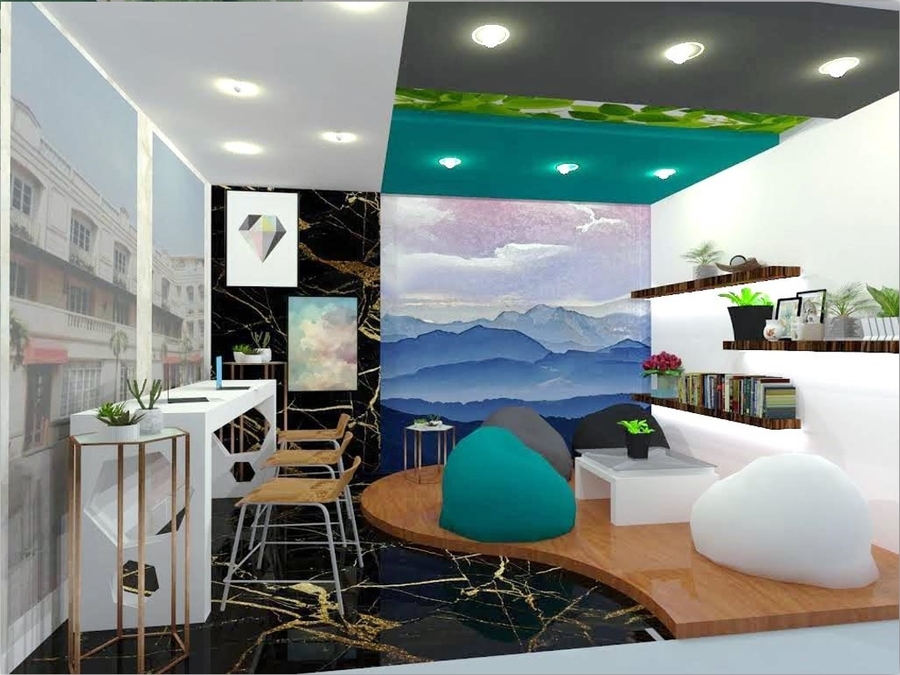
Incorporating “Viridescent” in my booth, the design itself is considered green and nature-friendly since natural geometric structure, such as curves & various shapes, establishes a space that brings light, clear and a connection to the natural world. With the preservation of leaves, it would be a big help in reducing the effects of climate change. The huge effect in using fossilized leaves We are group of individuals who grew up in burning leaves when they fall on the ground. We think leaves are worthless once they fall from their tree. I thought so, too. Burning leaves and wastes is dangerous to one’s health. Leaf and waste burning releases a huge quantity of poisons in the environment including: Carbon dioxide and carbon monoxide. Too much carbon dioxide can lead to global warming and the destruction of the ozone layer. Therefore, to contribute in lessening the bad effects of climate change, preservation of leaves is being studied and should now bethe latest trend. These preserved leaves may serve as a wall, ceiling and even for furniture décor. These are also framed and display as part of the interior accessory. With these being said, it is a huge contribution if people would preserve the leaves rather than burning it and causing a lot of problems. The students’ lounge is designed to be simple yet functional and practical. It implicates on reducing energy in-use, applied the process of recycling and the use of locally made materials and finishes that proves to be sustainable and eco-friendly. The materials are a big component in designing the students’ lounge. It made it possible to have an eco-friendly interior in different institutions.
Come and visit every booth and see how each design solution is executed. Design without compromising the environment.
Venue Address: 4th floor Fresco Area, Century City, Kalayaan Ave. cor. Salamanca St., Brgy. Poblacion, Makati, 1210

