Whoever said functional can’t be pretty?
Whenever we buy consumer goods, the packaging is alway a throw-away since it’s just a piece of labeled plastic or cardboard. But even packaging can be made into unique and innovative containers that borders on art.
Packaging design is one of the categories at the A’ Design Award and Competition, a yearly competition that welcomes creators and inventors from all over the world to submit their work. They cover a wide array of categories including furniture, packaging, architecture, fashion, interior design, and others. The 2017 winners have already been announced and they are all straight-up magic.
Check out some of our favorites from the packaging design category:
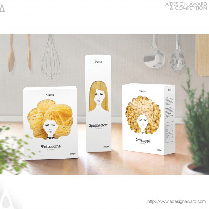
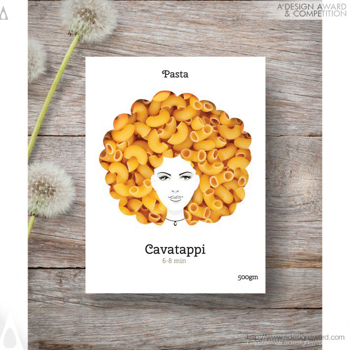
1. Pasta Nikita Packaging by Nikita Konkin
In the words of the creator: “I use the strands and shapes of pasta to create an interesting series of packaging that capture attention on the shelves. It emphasizes the high-quality & naturalness of pasta. And of course It should bring good mood for people with good taste.”
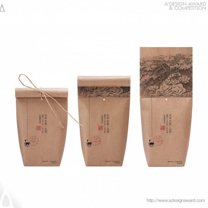
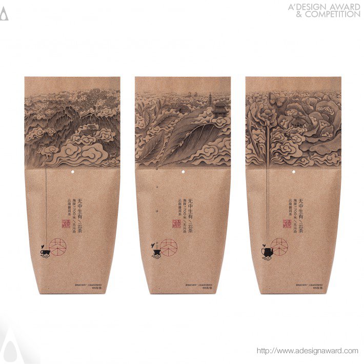
2. Nothing is Something– Cloudy Tea Packaging by Lin Shaobin
In the words of the creator: “Combined with the packaging of traditional Chinese calligraphy and painting scroll, the design involves the inspiration of scroll into the tea tube and tea bag, which has different features from other designs. The advantages of this design is that people will have a sense of ritual when they opened the package. After opening the knot, it unfolds a picture of Chinese landscape painting which is composed of the roots of a tree, leaves of tea and flower of tea. ”
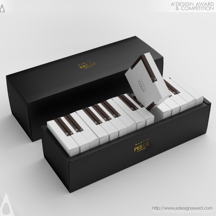
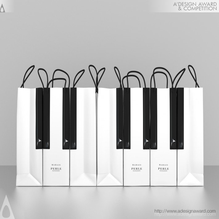
3. Marais Piano cake packaging by Kazuaki Kawahara
In the words of the creator: “We know that you will be giving this gift to someone important to you, and you want to give them something that was made with care. We’ve made each and every one of our gift boxes with our customers needs in mind. With each key of this gift box, your feelings are sure to be heard.”
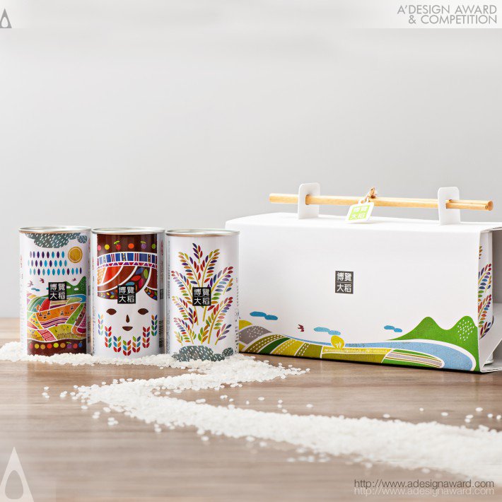
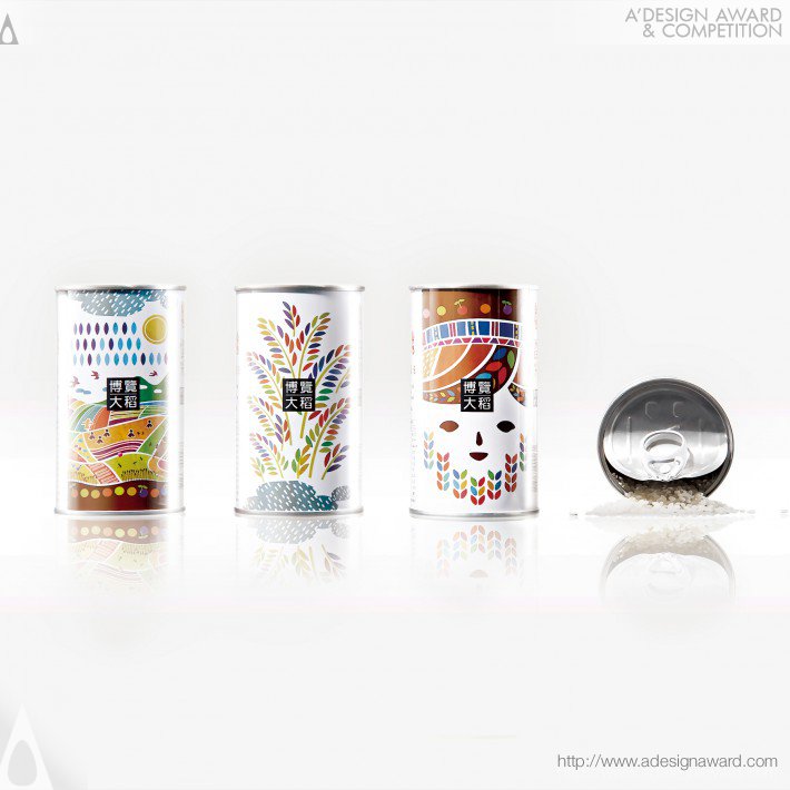
4. Brown’s Rice Packaging by U VISUAL COMMUNICATION
In the words of the creator: “The package design captures the spirit of the aboriginal people of Taitung Province and its local colour: from the people (aboriginal imagery of indigenous farmers), to the land (imagery of natural resources), to the local culture (imagery of the celebrations that follow a bumper harvest). While the souvenir tells the story of Taitung’s aboriginal culture, its innovation is to also perpetuate tradition, so that the rice is not only a gift, but a record of Taitung’s story.”
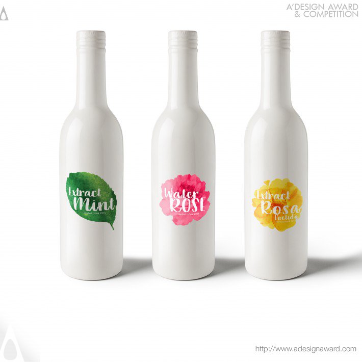
5. Herbal Drink Bottle by Azadeh Gholizadeh
In the words of the creator: “This is a limited edition herbal drink design which is inspired by the shape of flowers. I tried to use pure colors with minimal design. The fundamental reason that I used these items is that our customer wanted a unique design to show their product features clearly like being natural, clean and healthy, to name a few.”
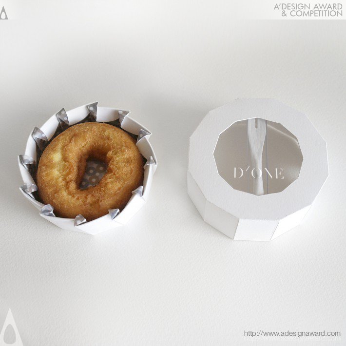
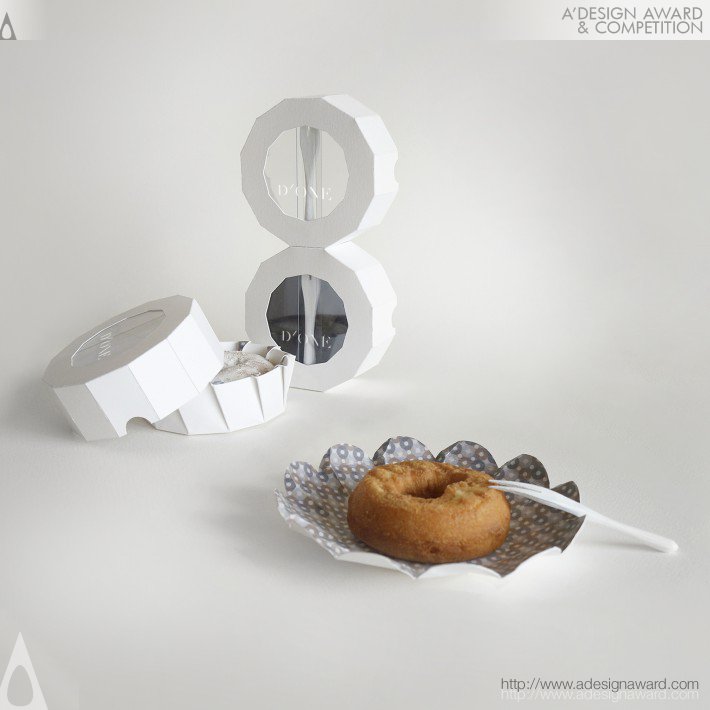
6. D’One Packaging by Jia-Ru Lin
In the words of the creator: “D’One is a small but exquisite packaging design for donuts. The concept is to enhance the experience of eating a donut. The design is a clean and modern. D’One packaging includes a fork, a donut, and a plate. The bottom carton not only serves as a container for the donut, but can also be transformed into a beautiful plate when it is unfolded. The dodecagon shape stops the packaging from rolling around, and it is easy to stack on a shelf too!”
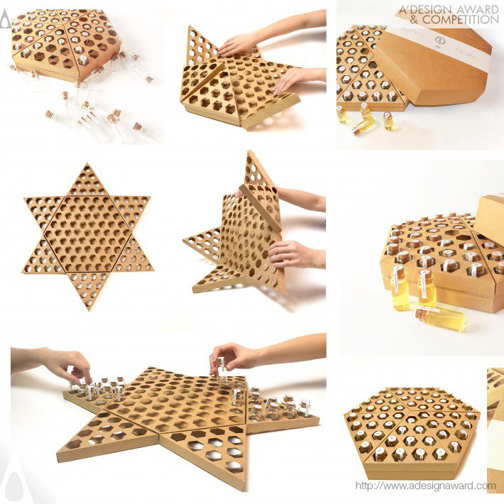
7. Funny Honey packaging by Lu Zhao, Jian Zhang, Lin Huang, & Tingyue Yan
In the words of the creators: “This honeycomb structure, through folding and reversing, can become a checkerboard. After they are emptied, the bottles containing the honey can be used as a pawns.”
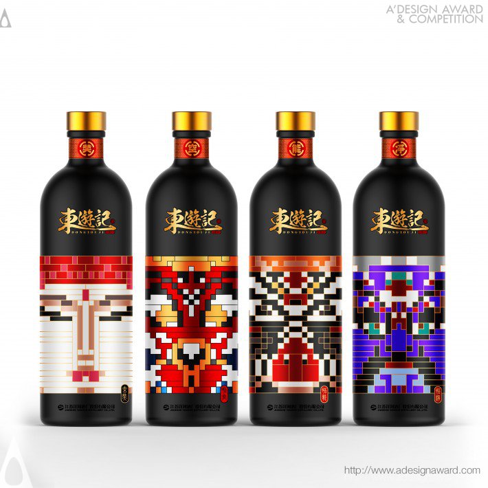
8. Journey to the East wine bottles by Bo Zheng
In the words of the creator: “Excellent traditional culture must be inherited. The theme of these bottles is the “Journey to the West” from traditional Chinese literature.”
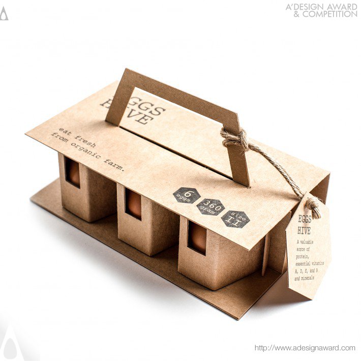
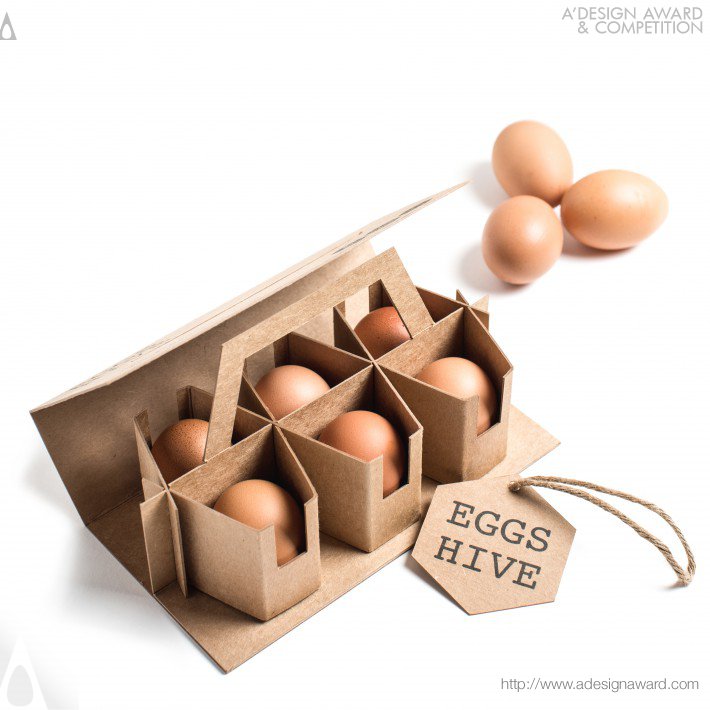
9. Eggs Hive by Chaiyasit Tangprakit
In the words of the creator: “The main purpose of the design is to have a strong packaging that can bear external force to protect the eggs while shipping. Therefore, the idea of using the structure of a beehive came to mind. To save cost and to be eco-friendly, the idea of not using glue is introduced. The material is made of kraft paper which is easy to recycle, and the divider is designed using the insertion technique.”
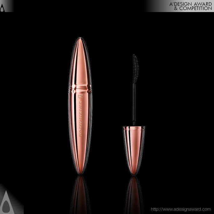
10. MOTEMASCARA ONE by Yuji Tokuda
In the words of the creator: “MOTEMASCARA ONE is the top product in the MOTEMASCARA series, Japan’s best-selling mascara. Everything’s been re-examined—from the specs to how it’s made—and evolved to create an unparalleled mascara. Everything women want in a mascara is here. The package expresses a crystal polished to shine like a peerless jewel. The materials, previously used only to make works of art, bring out a majestic sense of transparency.”
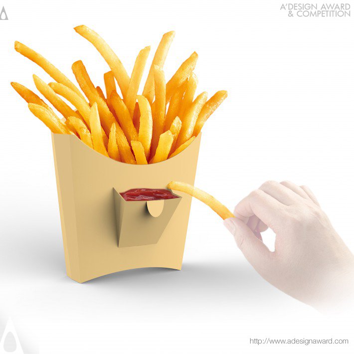
11. LITTLE POCKET French fries box by Dong Jiang-UESTC,Zhongshan Institute
In the words of the creator: “People always like to squeeze the ketchup on a paper tray. However, there are organic pollutants like heavy metal oxide on the printing paper tray that can cause cancer if you eat that way for a long time! This is a french fries box design. The “little pocket “on the front can guide users to squeeze ketchup in it, rather than on a paper plate.”
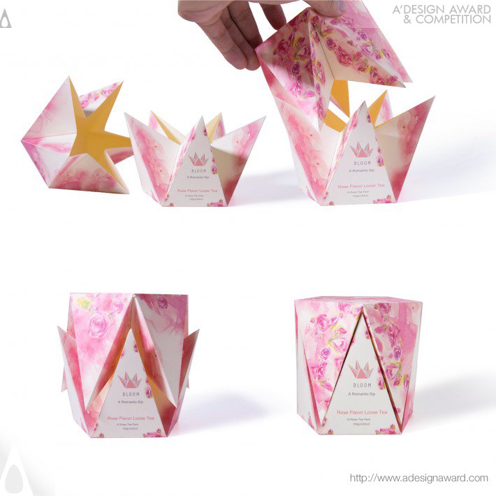
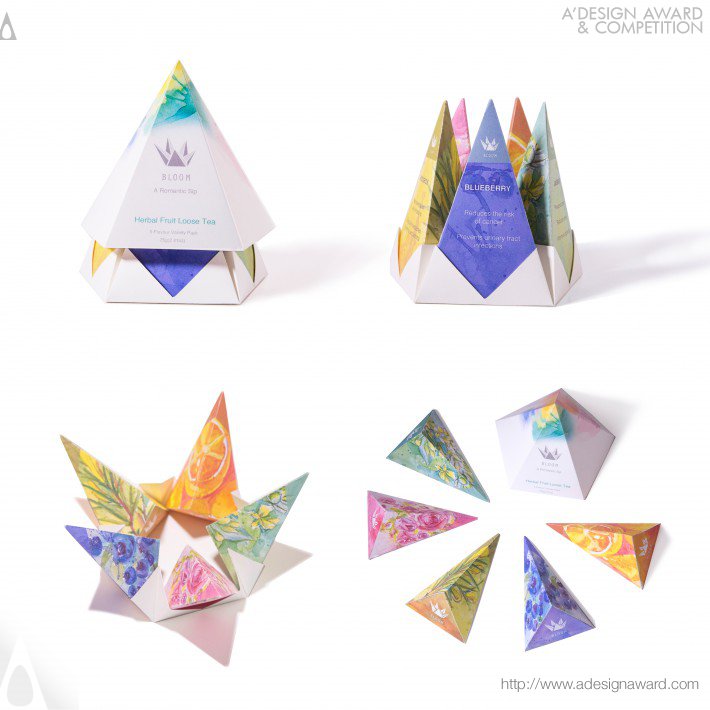
12. Bloom Tea Packaging by Danyang Pang
In the words of the creator: “Today people live in a fast paced society under a lot of pressure. Drinking tea is a valuable way to enjoy life. It is also a method to keep relaxed… The packaging’s structure imitates a bloom. It will pop-up when a customer opens the packaging, like the blooming process. The packaging can be closed smartly by interlocking one piece into another.”
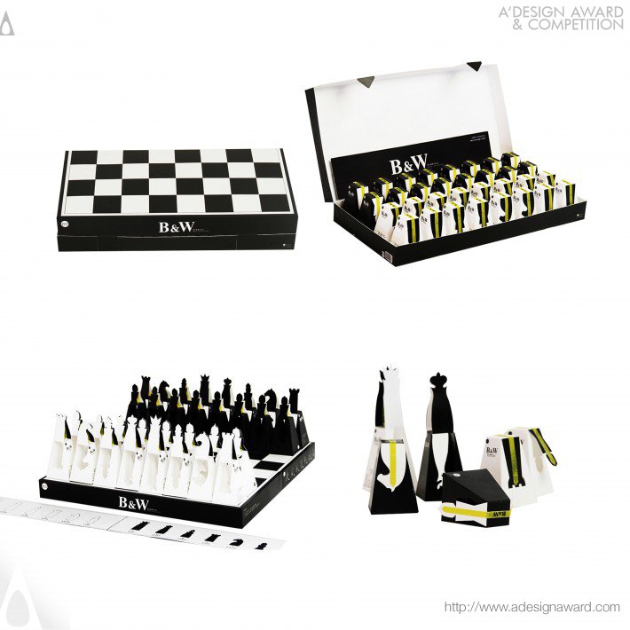
13. Whisky heart chocolate packaging by Lu Zhao, Jian Zhang, & Chaoyi Wang
In the words of the creators: “It is designed for black liquor heart chocolate packaging. After eating the chocolates, the packaging can be used as a functional chess piece.”
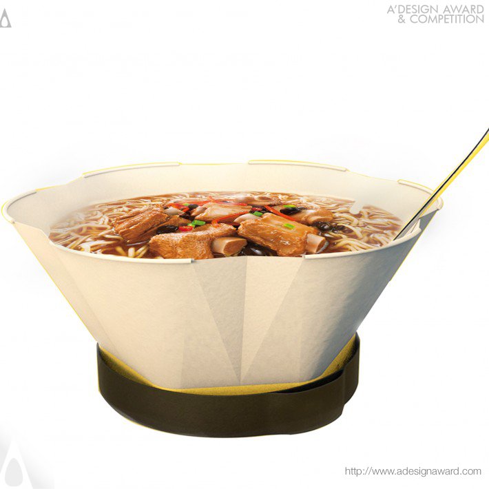
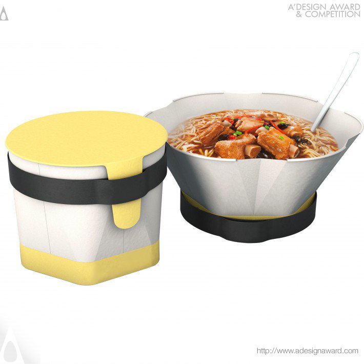
14. Enjoy your moment Instant noodle packing box by Cao Weizhi, Ding Jian, & Chen Yuru
