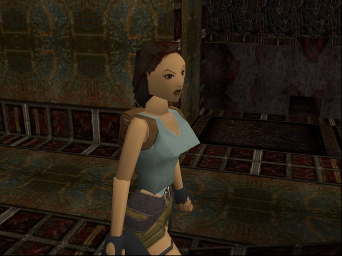
Remember those old blocky games people played back in the late 90s and early 2000s? We can think of games like 1996’s Tomb Raider with Lara Croft’s triangular ‘assets’ and Hagrid’s memey face from ‘Harry Potter and the Sorcerer’s Stone.’

These games had enjoyable gameplay but understandably bad graphics for its time. However, there are plenty of examples of game developers who somehow found a way to create stylized graphics of their game despite limitations, and as a result, their game’s art still holds up today.
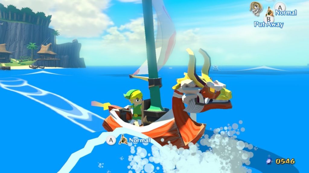
The Legend of Zelda: The Wind Waker

At first glance, one might not believe that The Legend of Zelda: The Wind Waker is a 19-year old game. The game’s designers made use of cell shading on their low-poly 3D models, which gave the game a nice mix of a cartoony and a 3d look. It actually looks like a modern game for the mobile, so it’s hard to process that this game was released for the Gamecube – a console with very limited processing powers. The game designers thought of many workarounds to make everything look good – from the ocean, the wind, and even Link’s expressions. There’s even a website that delves deep into the look of this game, made by Nathan Gordon.
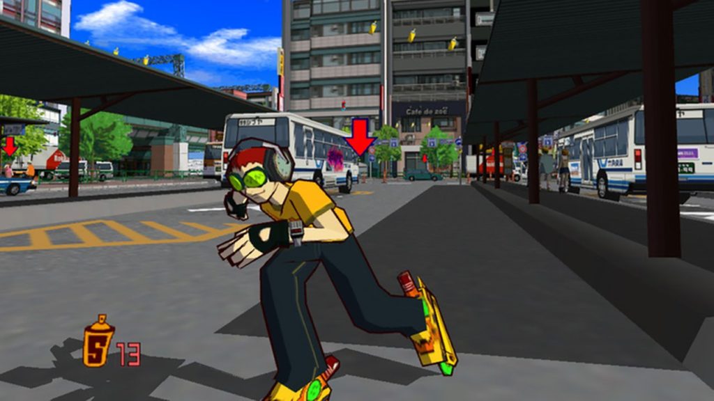
Jet Set Radio

Like Wind Waker, Jet Set Radio is another game that uses cell shading to give their art an anti-aging look. Since this game was released in 2000 for the Dreamcast console, it was groundbreaking in that it was one of the first ever games to use cell shading in order to mix 2D and 3D together in a way that even non-gamers would appreciate. With their use of thick lines and bright colors, Jet Set Radio was not only fun to play, but was and still is a visual masterpiece.
Killer 7
Killer 7 was released back in 2005 for the Gamecube and the PS2. While some criticized its confusing plot and restricting plot, many found its visuals to be unique and beautiful. It’s definitely not for everyone since it’s recognized as an arthouse game with a political plot, but the visual style and graphics still hold up in 2021.
Okami
Okami is another game that makes use of cell shading to create a unique style. It’s very much inspired by Japanese art and calligraphy, with graphics made to look like the whole world is watercolor. Since this game is a dialogue-heavy, story-driven game, much of its main appeal is the visual style that it presents. To prove my point, one major game mechanic is something called the Celestial Brush. Players use this Japanese calligraphy brush to paint on the screen, and it either creates things like a bridge, or cuts enemies by drawing lines through them, Fruit Ninja style. Okami is a game that was released in 2002 initially for the PS2, and I assure you that many people still love the game for its warm visuals today.
These four games prove that realistic graphics should not be the standard for modern games, as art direction and style can make visuals timeless, when done right. Realism isn’t bad, but style can give a game a certain uniqueness to it that 4k HD RTX graphics simply can’t achieve.
Other POP! stories you might like:
5 surprising benefits of playing video games
Remembering video games that made our childhood awesome
Pinoy indie games curated for preservation as Adobe Flash Player ends

