Have you ever tried spicing up one of your tweets by adding aesthetic or edgy fonts? Well, even if you just aren’t like other Twitter users, you might want to reconsider using the standard font provided by Twitter and here’s why:
On May 1, 2021, Twitter user Saff (@saffiecrossing), resurfaced an old tweet from Kent C. Dodds (@kentcdodds), explaining that the use of these third-party generated fonts actually creates a difficult experience for anyone who may be using assistive technologies such as the voice over feature.
it’s been a while, but i still see people using these “aesthetic fonts” so here again to share why you shouldn’t use them.
do better. stop using them. https://t.co/9sWqe5Ag7l
— 🧦 (@weasluv) April 30, 2021
Smartphones created by companies such as Apple and Samsung, come with assistive features in order to create more accessible products for more types of consumers. As Twitter users Saff and Kent C. Dodds have pointed out, the use of these non-standard “fonts” on Twitter, provide an unpleasant experience for people who may be utilizing these.
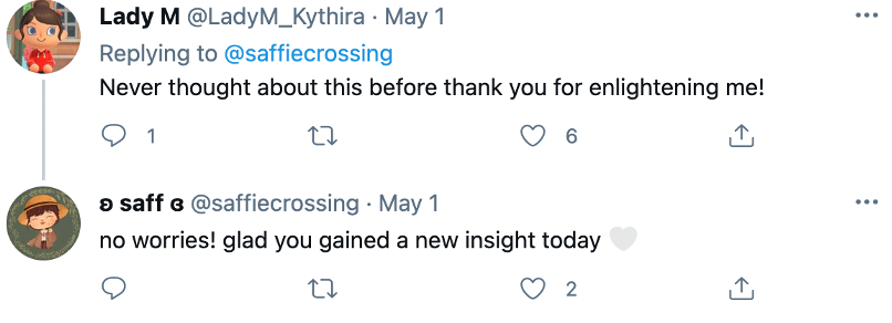
Most of the replies to Saff’s tweet were expressions of affirmation and gratitude, thanking the user for bringing this issue to light and informing them about the situation.

Other users expanded the conversation, explaining how these “fonts” create a difficult Twitter experience for more than just those who may be relying on text-to-speech technology. People with dyslexia also find difficulty with reading these “fonts”.
Some users questioned the capabilities of the assistive technology which helpful users addressed. They explained that the non-standard Twitter “fonts” used, are not even fonts in the first place. The characters are generated from a third-party website, causing them to be unrecognizable as fonts by the assistive technology.
Another user explained that with the thousands of special characters that exist online, it would not be plausible to integrate each one into text-to-speech software.
These special characters may be used in personal accounts and profiles, where one may have a clear picture of who might be following them, but this may not be the case for public accounts.
So, the next time you want to publicize one of your ingenious thoughts, you might want to keep things simple to be able to reach and communicate with more people. Don’t let a “font” get in the way of interacting with others — even if it seems more “aesthetic”. Your words are spicy enough.
Other POP! stories you might like:
‘He works, She cooks’: Google Translate results reveal gender bias in tech
Ben Affleck debunks a (gone) girl’s doubts when she unmatches him on Raya
Twitter’s Tip Jar makes it easier to send tips, but it has a privacy issue
TikTok user unexpectedly becomes the founder of a new cryptocurrency
Intel’s Bleep aims to address hate speech in gaming but is it really helpful?


