The Philippine Amusement and Gaming Corporation (PAGCOR) recently revealed its new logo in celebration of its 40th year. However, many Filipinos online were not happy with the the state-run-gaming and regulatory firm’s new logo.
Pagcor’s old logo, which shows a green hand holding what looks like a light, had been in use for the past four decades and was, in a way, reflective of the institution. The new logo unveiled now has flame licks in blue and red gradients, which, according to Pagcor Chairman and CEO Alejandro Tengco incorporates the element of fire associated with “energy, inspiration, passion, and transformation.”
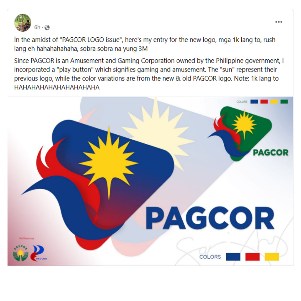
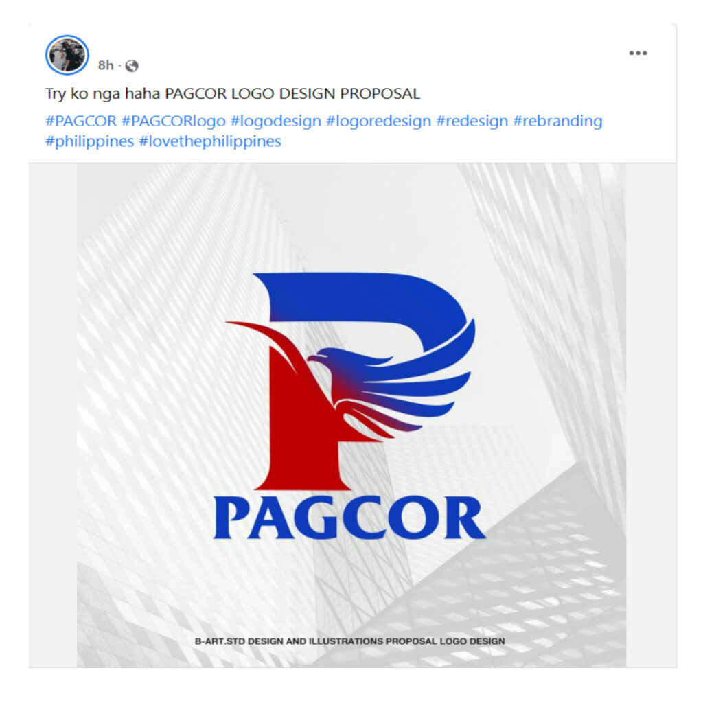
Reports of the new Pagcor logo costing P3 million pesos to make did not sit well with many Filipinos who found the new logo dis-satisfactory. Many internet users started poking fun and sharing their funny interpretations of the re-design, such as popular web and comics artist Tarantadong Kalbo’s versions of the logo. But setting aside these comments and reactions by online users, some graphic designers and artists actually shared their professional take on how Pagcor’s new logo should look like, along with their ideas and rationale behind their concepts. Here are some of them:


Of course, there are the cheeky ones, such as this one:
According to a report by INQUIRER.net based on a publicly available document dated June 27, 2023, a certain Printplus Graphic Services won the project bid and was awarded the contract price of P3,035,714.28.
Is Taylor Swift’s ‘When Emma Falls In Love’ a reference to Emma Stone-Andrew Garfield relationship?

