Google introduced their playful new logo today using their own sans serif typeface called Product Sans. This is the company’s first major branding update in 16 years and the reception has been mostly positive.
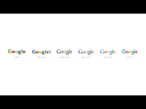
But that’s not the only change in place. You know that familiar little blue “g” icon? In it’s place is a four-color uppercase “G” that matches the brand’s color scheme of blue-red-yellow-green. The same redesign also applies to the previously nondescript Google mic.
Clever enough, Google’s minimalist four-dot scheme has been given a “human touch” and lets you know when Google is interacting with you as it bounces around, reacts like a visual EQ, and rotates depending on the action you’re taking.
![]()
According to Google’s official blog, the reason behind the change is to have a single identity across all devices and inputs since the way we now interact with its products — and with technology at large — has evolved.
The tech giant further points out, “This isn’t the first time we’ve changed our look and it probably won’t be the last, but we think today’s update is a great reflection of all the ways Google works for you across Search, Maps, Gmail, Chrome and many others. We think we’ve taken the best of Google (simple, uncluttered, colorful, friendly), and recast it not just for the Google of today, but for the Google of the future.”
What do you think of Google’s new design direction? Tell us in the comments below.
MOST READ
LATEST STORIES